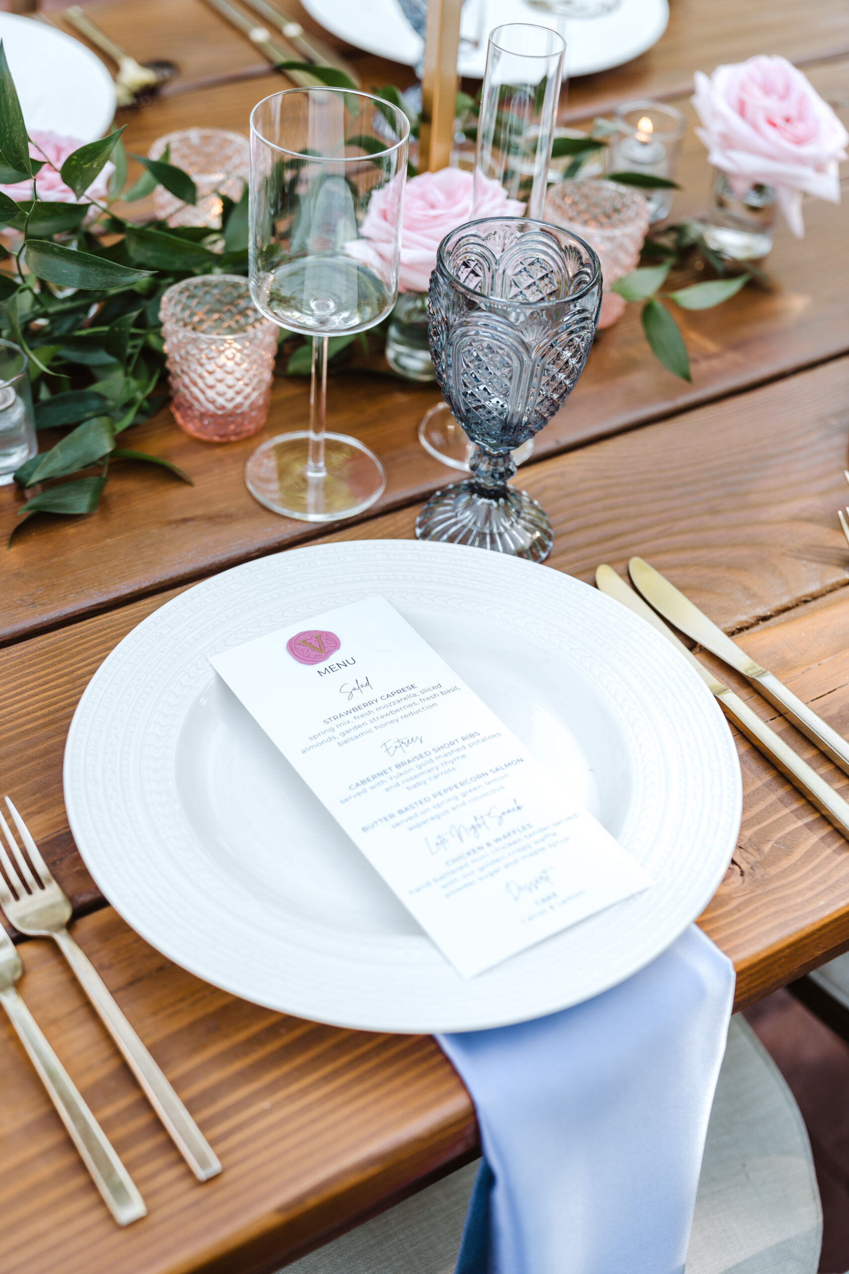
To match your menu cards and place cards to your invitation, carry over three anchors from the invitation into every piece: the same typefaces, the same color palette, and the same material or texture (paper weight, acrylic finish, or fabric). When those three elements stay consistent, everything from the mailbox to the reception table reads as one intentional, cohesive story.
That’s the heart of what we do — take the look you fell in love with and let it echo across every detail of the day, so nothing feels like an afterthought. Here at The Details and Story Co., we design, letter, and print these pieces in-house whenever possible, which means your menus and place cards can be true siblings to your invitation rather than distant cousins. Below is a practical checklist to get you there.
Start with your invitation as the master reference
- Pull the exact fonts. Note the display/headline font and the body font from your invitation suite. Reusing both — a script for names, a clean serif or sans for details, for example — is the single fastest way to make everything feel related. If your invitation was designed by an outside stationer, save the artwork or a high-resolution image so we can match it precisely.
- Capture the color palette. Identify your primary ink color and any accents (a blush, a sage, a deep navy). Ask for the exact color values if you have them. Colors should carry through the menus and place cards, not just “be close.”
- Note the motifs. A sprig of greenery, a monogram, a crest, a hand-drawn desert bloom — small repeated motifs are the glue that ties a suite together. Decide which one or two travel from the invitation to the table.
Choose materials that speak the same language
- Match or complement the texture. If your invitation is soft and organic, fabric place cards and paper menus keep that mood. If it’s crisp and modern, acrylic can echo it beautifully.
- Consider acrylic finishes intentionally. Acrylic is thick, durable, and elevated — we offer clear, frosted, colored, and pearlized, plus solid opaque when you want a painted, saturated look. Frosted acrylic place cards feel especially soft and luxe against a floral table.
- Pair thoughtfully. Acrylic loves being paired with fabric or mirror for depth and contrast. For a warm, keepsake feel, fabric and paper carry the day gracefully.
- Keep textures consistent across pieces. Your menu and your place cards should feel like they belong to the same family — same stock, same finish, same edge treatment where possible.
Coordinate the lettering and print details
- Decide on the name treatment for place cards. Printed names keep everything perfectly uniform with your suite. If you love the softness of hand lettering, we coordinate calligraphy through our partner Lettering House AZ so it complements your printed pieces rather than competing with them.
- Mind the small type. Menu descriptions and course headings should use the same hierarchy as your invitation — same weights, same spacing sensibilities.
- Add texture where it delights. Raised-texture UV printing can bring a detail to life — the salt rim on a margarita, the orange-rind garnish on a cocktail, even the fur on your pet if a beloved dog is part of your story. It’s a lovely way to make a menu or signature-drink detail feel custom without shouting.
Think beyond the two pieces
- Extend the look to the whole tablescape. Menus and place cards live next to napkins, table numbers, and your escort display. Matching those anchors — fonts, color, material — is what makes a room feel designed rather than assembled.
- Consider keepsakes. Place cards can double as favors. Laser engraving lets us personalize luggage tags, vow books, champagne flutes, wine bottles, and wood bottle openers in the same style as your suite — so guests take a piece of the day home.
- Plan for your escort display. If you’re doing an escort display or seating chart, the lettering and printing should match the menus and place cards exactly. We letter and print those; the display wall or shelf itself is fabricated by our partner, and we bring the two together.
Handle the logistics early
- Confirm quantities and guest counts. Place cards are guest-count sensitive. For Arizona couples, we intentionally print seating-chart cards two days before the wedding to absorb last-minute changes — a small thing that saves real stress.
- Know your timeline. Menus are a mid-complexity item with a typical turnaround of about seven days after artwork approval. Simple signs can move in as little as two days. Build in time for a proof so the match is perfect before we produce.
- Sort delivery vs. pickup. Delivery, setup, and pickup are available as add-ons in Arizona, or you can will-call from our Mesa, Tempe, or Goodyear locations. Marrying in Arizona from out of state? We ship custom-made menus and personalized goods anywhere in the U.S. (rental pieces and setup stay within Arizona).
- Check what drives the cost. Material, size, quantity, and complexity all shape pricing, along with any delivery and setup. Current pricing lives on our services page at https://detailsandstory.com/services.
The two things couples most often overlook
- Proof against the invitation, not from memory. Before approving, hold the printed menu and place card next to the actual invitation. Screens and lighting shift color; a side-by-side comparison is the only way to know the match is true. (Once artwork is approved, custom items go into production and are non-refundable — so this step matters.)
- Match the font weights, not just the fonts. Two pieces can use the “same” typeface and still feel off if one is light and the other bold. Consistent weight and spacing is the quiet detail that makes a suite feel expensive.
When every piece speaks the same language, your guests feel it the moment they sit down — and you get the cohesive, intentional look you pinned months ago, without the DIY stress. That’s the whole idea: we bring your vision together, so the details take care of themselves.
Frequently asked questions
Can you match menus and place cards to an invitation I bought from another stationer?
Yes. If you send us the artwork or a high-resolution image of your invitation, we can match the fonts, colors, and motifs so your menus and place cards feel like true siblings to your suite. For complex coordinated stationery we work with trusted vendors, while simpler pieces are produced in-house.
Should I use acrylic or paper for place cards?
It depends on the mood of your invitation. Acrylic is thick, durable, and elevated — available in clear, frosted, colored, pearlized, and solid opaque — and pairs beautifully with fabric or mirror. Paper and fabric keep a softer, more organic feel. We'll help you choose based on your tablescape and budget.
How far in advance should I order menus and place cards?
Menus are a mid-complexity item with a typical turnaround of about seven days after artwork approval, so plan to finalize your proof well before the wedding. For Arizona couples, we intentionally print seating-chart cards two days before the day to accommodate last-minute guest changes.
Can you ship my menus and place cards if I'm marrying in Arizona from out of state?
Yes. We ship custom-made signage and personalized goods, including menus and place cards, anywhere in the U.S. upon request. Rental pieces and delivery/setup services remain within Arizona, where you can also will-call from our Mesa, Tempe, or Goodyear locations.
Can place cards double as favors?
Absolutely. Laser engraving lets us personalize keepsakes like luggage tags, vow books, champagne flutes, and wood bottle openers in the same style as your suite, so a place card can become something guests take home.
Leave a Reply